

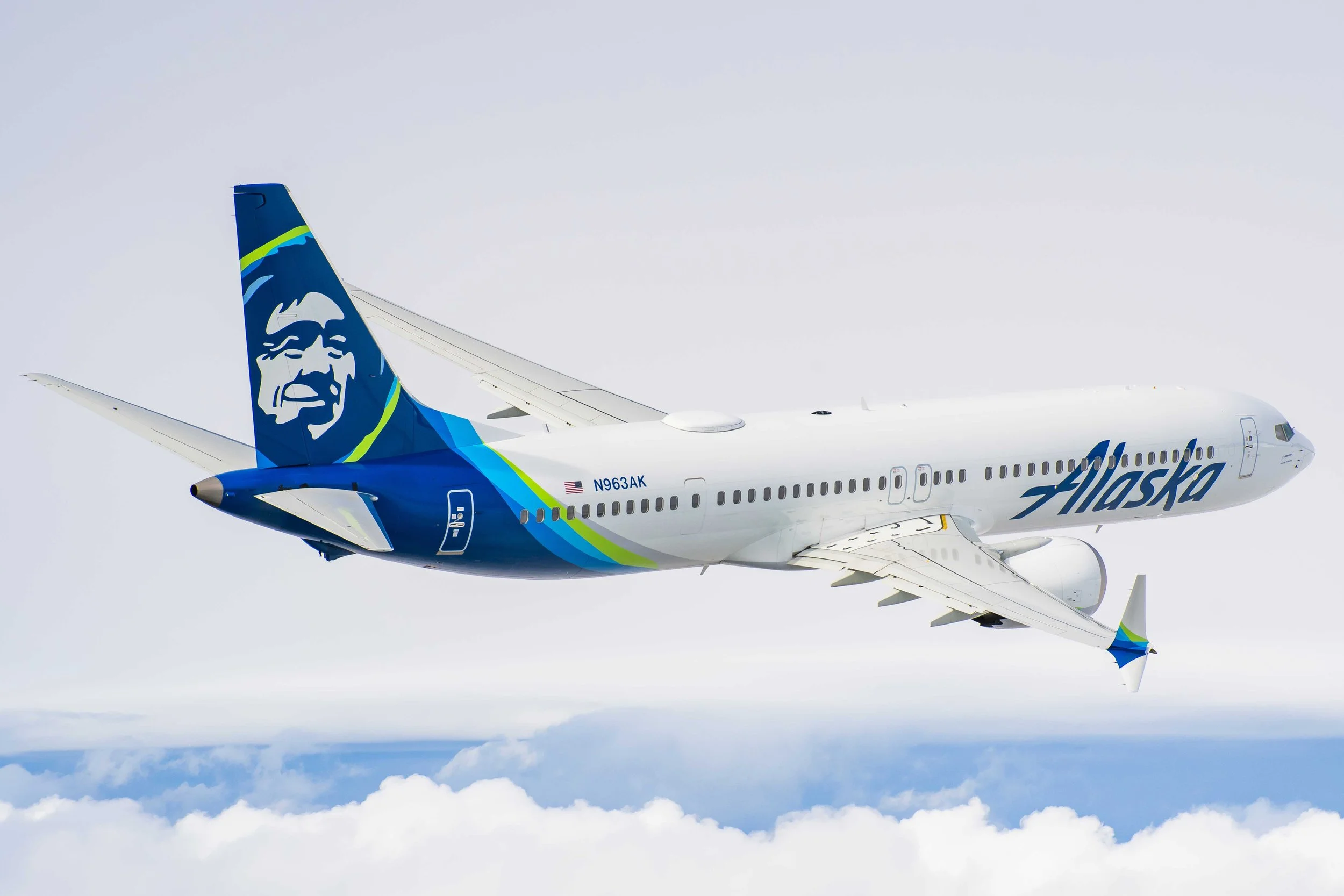
Alaska airlines flight attendant app
Building a digital-first guest experience
With the increasing number of mobile devices used by airline staff, there is a greater need for a platform that facilitates quick, easy, and effective ways to resolve technical hurdles and help manage in-flight duties
The problem
Solution
Introduce a new “on-the-go”, to what was previously called “SpotOn”… in-crew solution that is easily accessible, provides quick assistance, and doesn’t need any prior training to use, were a few of the design goals we aimed to achieve.
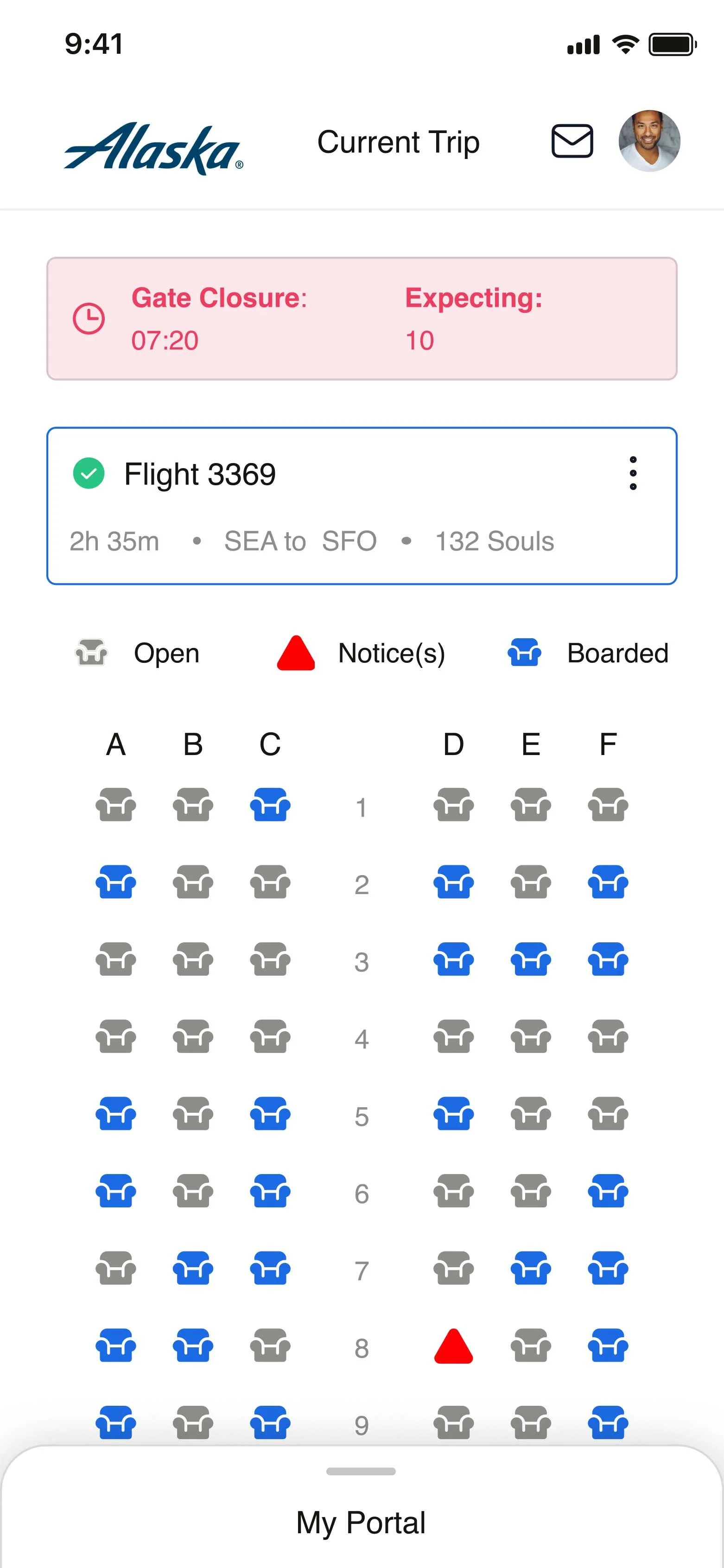
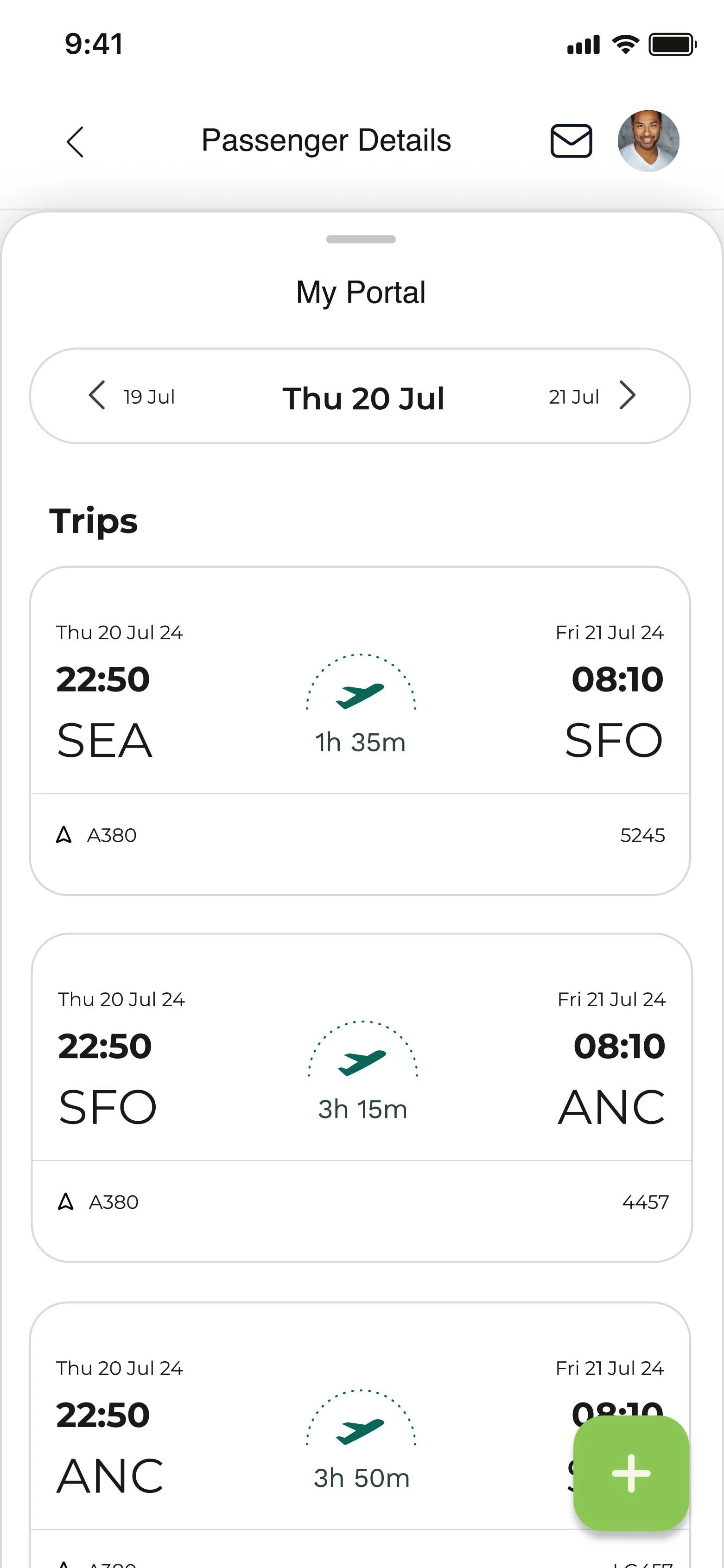
In a nutshell
Its primary goal is to help its staff increase ground-level efficiency by resolving their day-to-day technical hurdles in a centralized, efficient manner.
Defining the problem
There’s a need to facilitate quick response time from the IT services team, which is embedded in the daily routine of the flying staff, thereby making the process seamless. A solution that is easily accessible, provides quick assistance, and doesn’t need any prior training to use was a few of the design goals we aimed to achieve.
My role and the process
My Role
UX, UI, Product Design
Wireframing
Prototyping
UI & Visual Design
Usability testing
Split A/B testing
Personas
The Team
Product Manager
Developers (x6)
UX Researcher
Content Strategist
Copy Writer
Personas: Meet Linda
“Serving passengers while traveling is a privilege.”
Flight attendant since 2005
-
Communication between gate agents and in-flight crew is typically difficult
It’s difficult to know detailed passenger information for better service
-
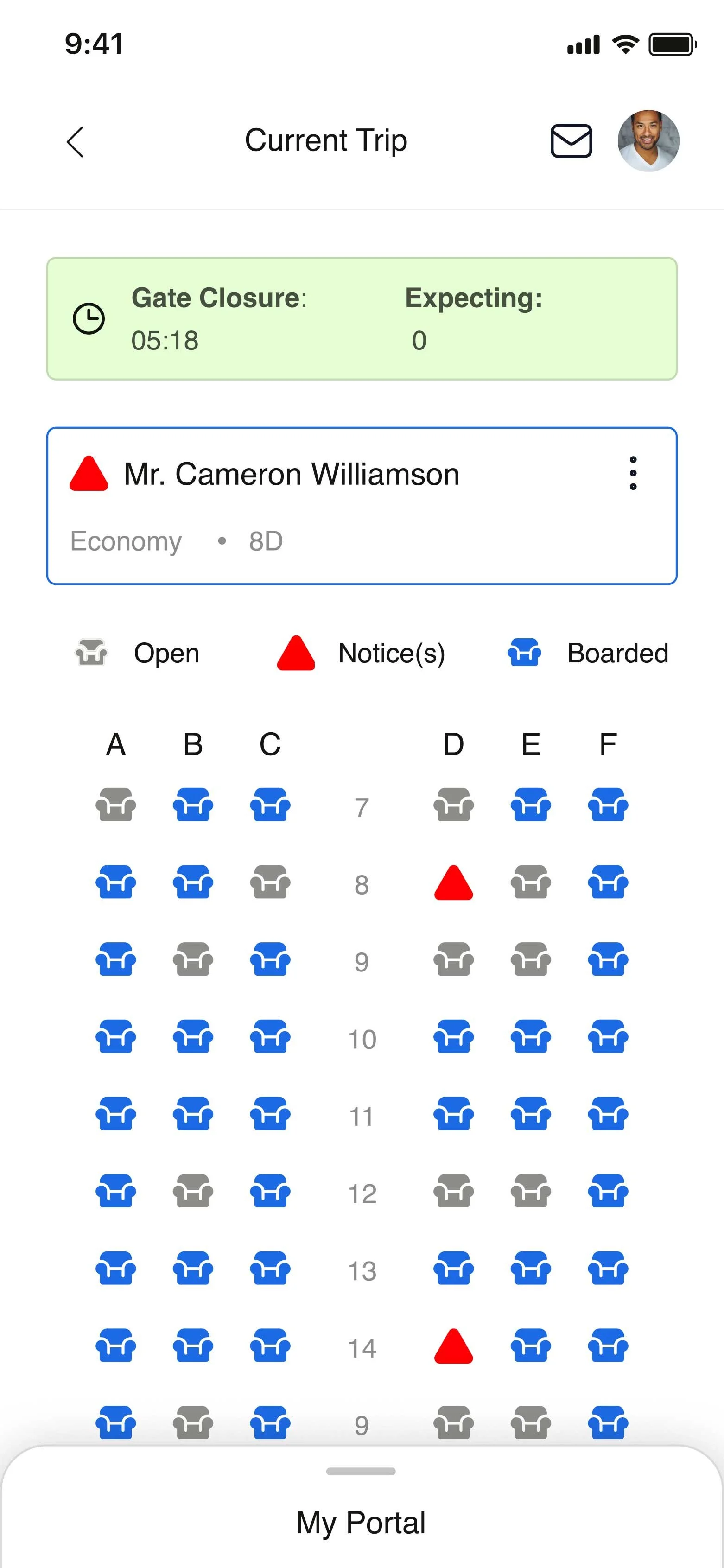
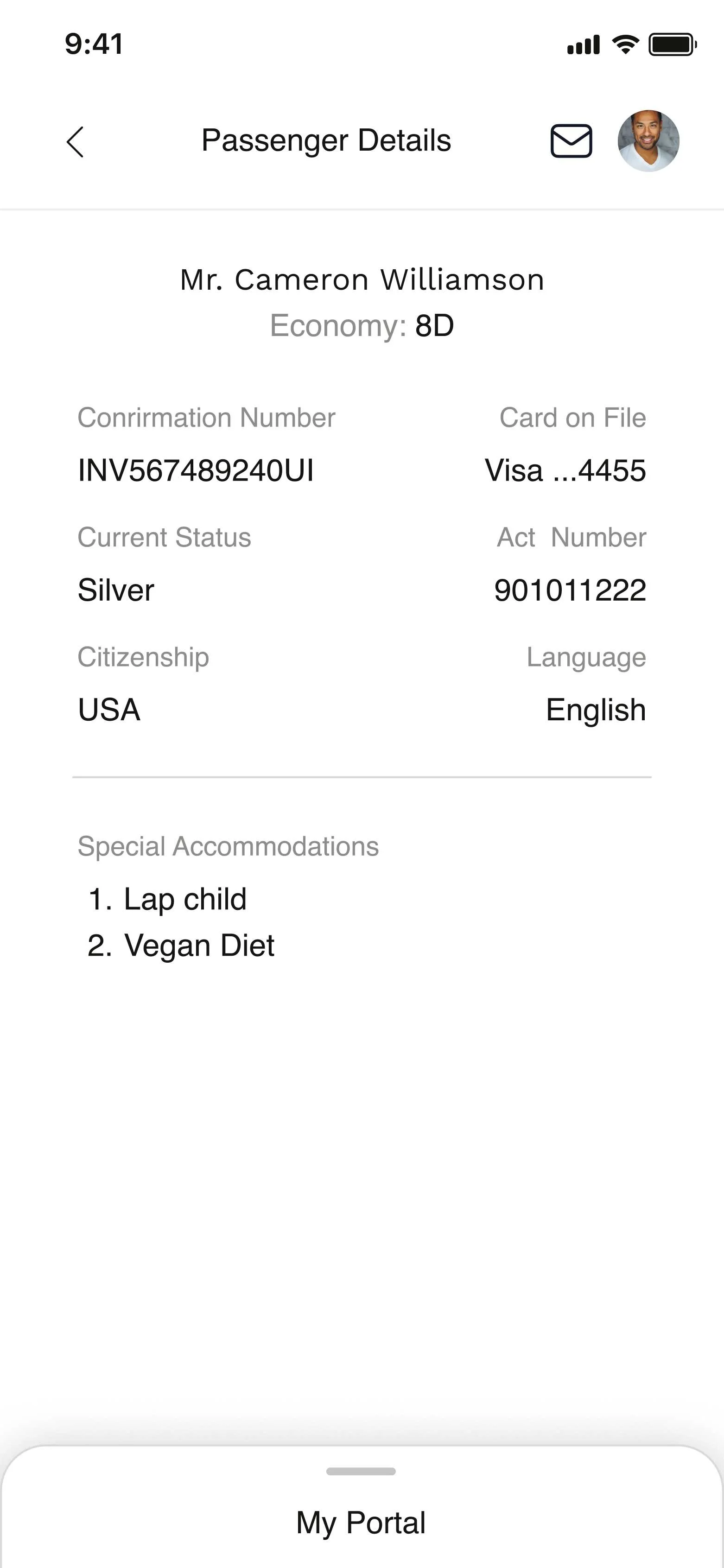
I need to know passenger details, like food preferences, etc, while in flight
I need real-time data on who’s boarded and how many passengers to expect before departure
-
That the passenger and crew experience seems seamless
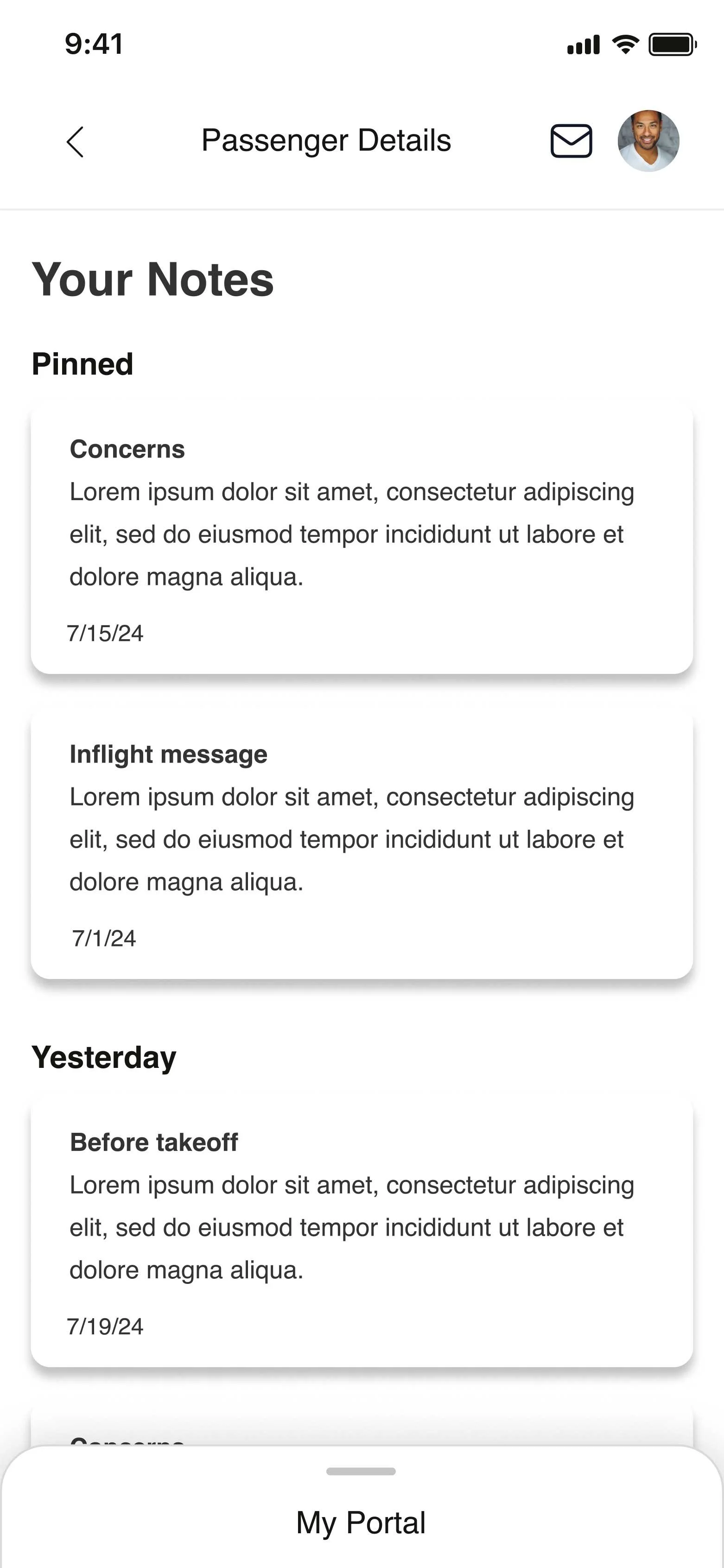
I’d like to be able to take flight notes and report while in flight
My process: I worked with the product team, which also consisted of a UX researcher with whom I worked closely on this project. Together, we would drive the product forward. I also collaborated with our content team, which included a product manager, a copywriter, and several developers.
The UX manager, along with UX researchers, led discovery workshops with Alaska Airlines customers to gather existing pain points and user insights about the current experience. I collaborated in these sessions to learn more about Alaska's In-flight team to gain perspective and empathy.
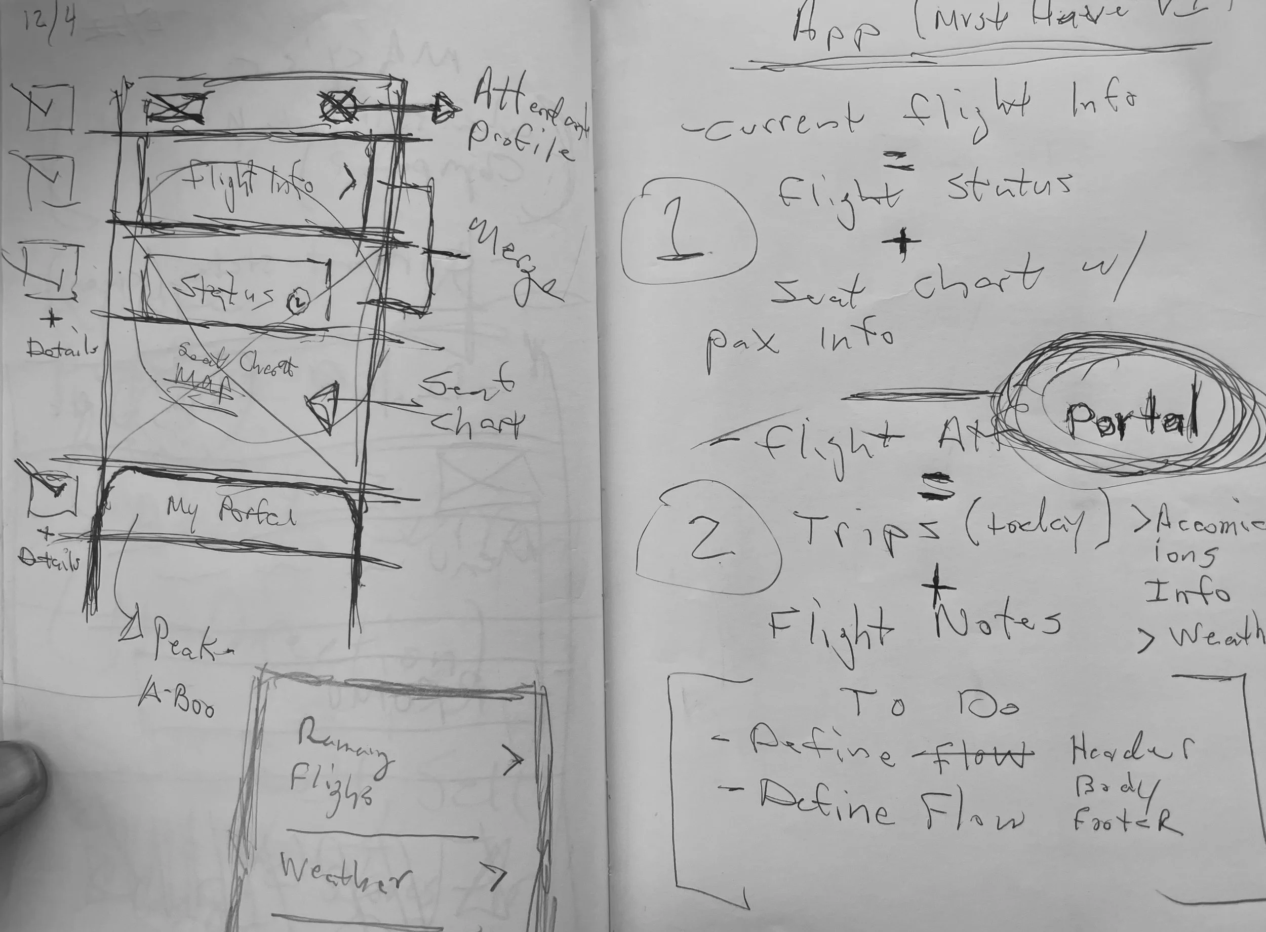
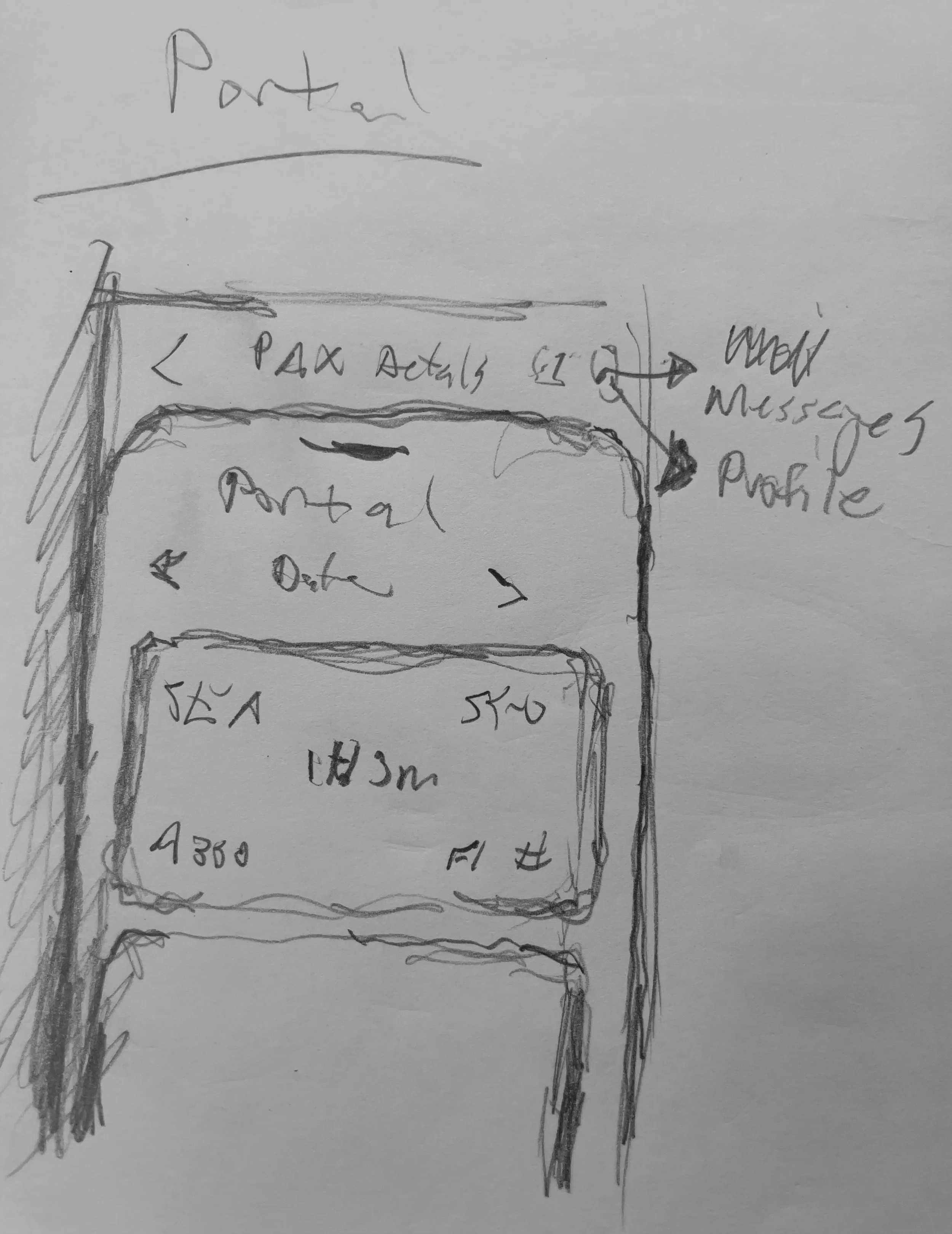
Sketches & Wireframes: As I normally do, I started the development and ideation process with a whiteboarding session involving information obtained by our team to generate some quick concepts but also to get the team inspired and thinking out of the box.
-
![]()
1. Ideations/Sketches
-
![]()
2. Ideations/Sketches
-
![]()
3. Wireframe Development
User testing
I paired with the UX researcher on our team and conducted several usability tests. Before addressing the visual design, we started testing our early concepts in grayscale wireframes to validate and solidify core functionality and usability issues.
Key results
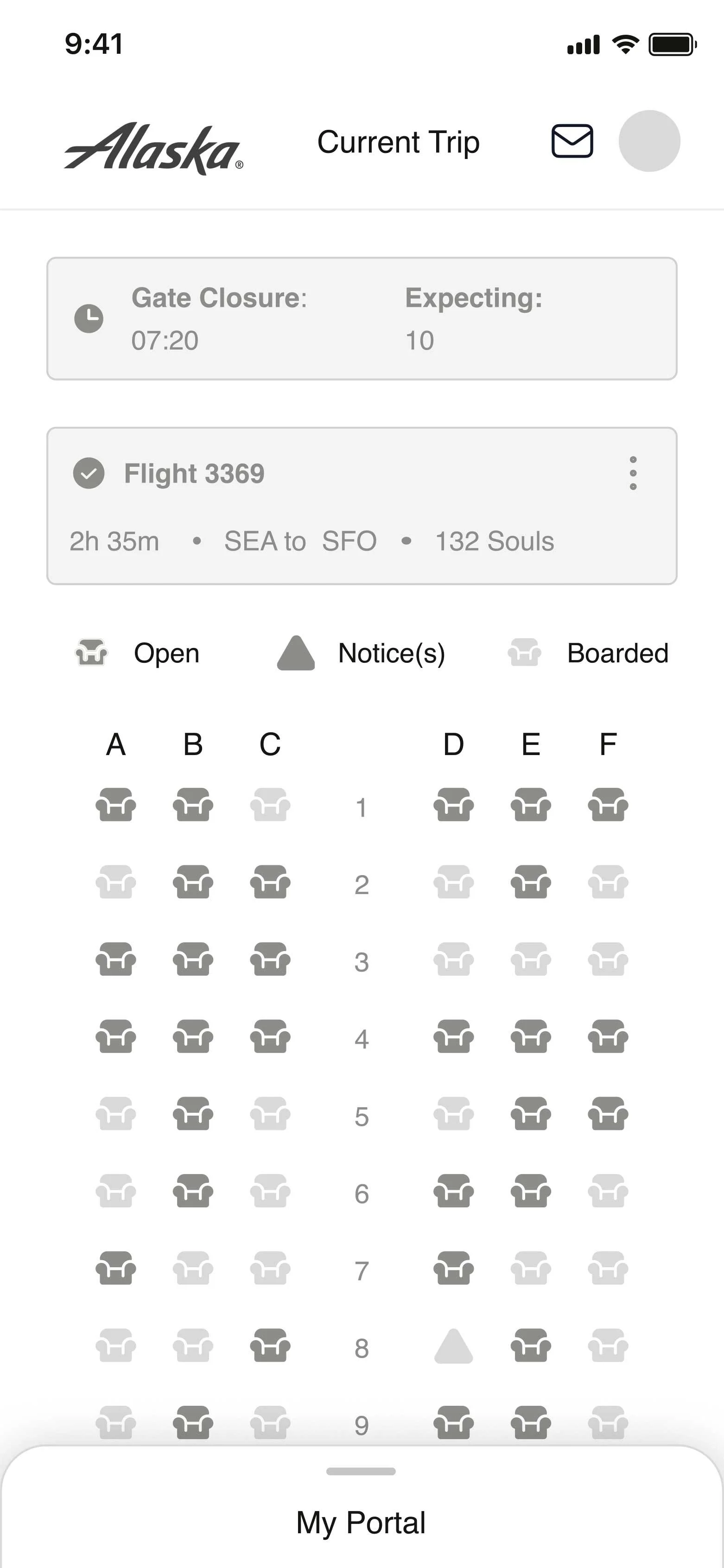
Overall, users were able to navigate through the app and “My Portal” without any issues
Most users were able to onboard and manage passengers without any friction, and completed onboarding faster
The visual design received high praise, and many users mentioned that it enticed them to travel more
Key Solutions
After several design sprints and months of testing, we successfully launched the new Alaska Airlines in-flight app. The new app was now on par with the legendary, friendly, and approachable customer service that Alaska's guests praise and love.
Outcomes
2X
Increase in mobile conversion within 6 months of launch.
14%
A decrease in inflight support calls related to flight services in the first 3 months of launch.
The new design solution was a successful MVP. It addressed the user pain points and met the business goals that we had defined. As happy as I was with the outcome, I wasn't satisfied. So many ideas and concepts didn't see the light of day due to time and tech constraints. Some of my ideas included a completely different mental model of personalizing the in-flight crew experience.